“It is the master who establishes the rules and not the pupil, and the master is permitted to break the rules, even his own.”
— Jan Tschichold to Dorothy Sayers
Tschichold claimed that he was one of the most powerful influences on 20th century typography. There are few who would attempt to deny that statement.
Between 1926 and 1929, he designed a “universal alphabet” to clean up the few multigraphs and non-phonetic spellings in the German language. For example, he devised brand new characters to replace the multigraphs ch and sch. His intentions were to change the spelling by systematically replacing eu with oi, w with v, and z with ts. Long vowels were indicated by a macron below them, though the umlaut was still above. The alphabet was presented in one typeface, which was sans-serif and without capital letters.
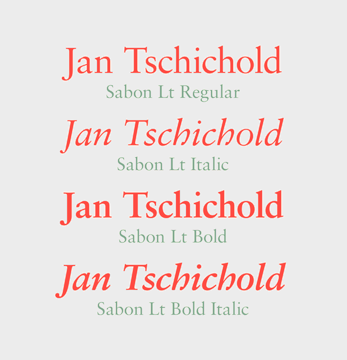
Typefaces Tschichold designed include: Transit (1931), Saskia (1931–1932), Zeus (1931), and Sabon (1966–1967), named after Jacques Sabon.
Much like Arial and Times New Roman, which are supplied as core (or system) fonts in virtually all printers and computer operating systems, Sabon was designed to provide a font that would perform well and predictably across a variety of imaging technologies. However, Sabon’s creation predates digital imaging—it was drawn to satisfy the needs of metal typesetting. Thus, Sabon can be considered the first typeface to be commissioned as a “core font.”
Designed by Jan Tschichold and jointly developed by Monotype, Linotype and Stempel, Sabon was intended to meet the common need for a typeface that would work consistently whether set in metal type through mechanical composition, or by hand composition as foundry type.
Garamond was the most popular text typeface at the time Sabon was drawn. While Sabon has been called a “modern” Garamond, this is somewhat misleading. Sabon is its own design, patterned loosely on specimen sheets of an early Frankfurt printer and type founder, Konrad Berner. The story is told that Berner married the widow of Jacques Sabon (hence the name) who brought some of Garamond’s original matrices to Frankfurt—thus the design similarity to Garamond.
There are two general traditions of Garamond-derived designs: those based on the calligraphic shapes closest to Claude Garamond’s original work, and those with softer, more rounded forms. Tschichold achieved Sabon’s versatility by not emulating either style exclusively; instead, the design partakes of the best qualities of both. Subtle calligraphic overtones make Sabon resilient in less-than-ideal printing and reading conditions, and its generous lowercase x-height keeps the design reader-friendly while maintaining the grace and elegance of the original 16th century fonts.
Sabon has been used successfully in just about every typographic application imaginable. Full counters, moderated contrast in stroke variance and relatively sturdy serifs add up to a design that is ideally suited to a wide variety of typesetting requirements.
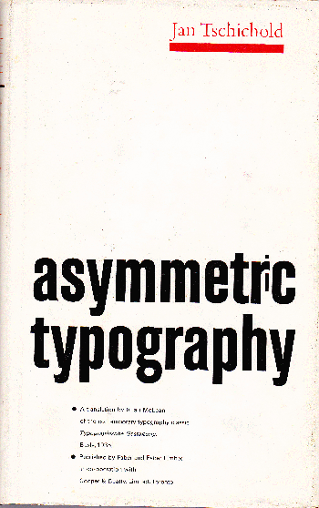
Tschichold considered Sabon to be his magnum opus, and it’s the only typeface he sought to be remembered by. And now, since Sabon has been translated into digital fonts, Tschichold’s achievement is also a modern Monotype masterwork.