“…the typographer is chained more than any other artist by the unalterable word…”
— Jan Tschichold, Essays on the Morality of Good Design
Tschichold had converted to Modernist design principles in 1923 after visiting the first Weimar Bauhaus exhibition. He became a leading advocate of Modernist design: first with an influential 1925 magazine supplement; then a 1927 personal exhibition; then with his most noted work Die neue Typographie. This book was a manifesto of modern design, in which he condemned all fonts but sans-serif (called Grotesk in Germany).
He also favoured non-centered design (e.g., on title pages), and codified many other Modernist design rules. He advocated the use of standardized paper sizes for all printed matter, and made some of the first clear explanations of the effective use of different sizes and weights of type in order to quickly and easily convey information. This book was followed with a series of practical manuals on the principles of Modernist typography which had a wide influence among ordinary workers and printers in Germany. Yet, despite his visits to England just before the war, only about four articles by Tschichold had been translated into English by 1945.
Although Die neue Typographie remains a classic, Tschichold slowly abandoned his rigid beliefs from around 1932 onwards (e.g. his Saskia typeface of 1932, and his acceptance of classical Roman typefaces for body-type) as he moved back towards Classicism in print design. He later condemned Die neue Typographie as too extreme. He also went so far as to condemn Modernist design in general as being authoritarian and inherently fascistic.
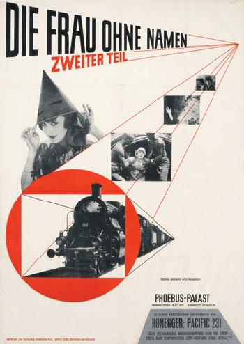
Between 1947–1949 Tschichold lived in England where he oversaw the redesign of 500 paperbacks published by Penguin Books, leaving them with a standardized set of typographic rules, the Penguin Composition Rules. Although he gave Penguin's books (particularly the Pelican range) a unified look and enforced many of the typographic practices that are taken for granted today, he allowed the nature of each work to dictate its look, with varied covers and title pages. In working for a firm that made cheap mass-market paperbacks, he was following a line of work—in cheap popular culture forms (e.g. film posters)—that he had always pursued during his career.
His abandonment of Modernist principles meant that, even though he was living in Switzerland after the war, he was not at the centre of the post-war Swiss International Typographic Style.