The New Typography
Since its initial publication in Berlin in 1928, Jan Tschichold’s The New Typography has been recognized as the definitive treatise on book and graphic design in the machine age. At once a key theoretical document of Central European modernism between the world wars and an invaluable source of working principles for the practicing designer, this classic work enjoys the reputation among book artists that Le Corbusier’s Toward a New Architecture has long held among architects.
The publication in English of this seminal work on 20th-century typography is long overdue. First published in 1928 in Germany and out of print for many years, this text has been recognized as one of the most important statements of modern typographical design. This curious and fascinating work ranges through theories of social criticism, art history, architecture, and the emerging importance of photography as it sets forth very definite guidelines regarding the design of printed materials. The final sections are indeed practical guidelines, down to sheet sizes and appropriate mixes of type, for the day-to-day use of working designers and printers.
In addition to presenting a clear and faithful translation from the German, the new edition takes special care with design and appearance, closely duplicating the type and layout used in the original. A clear introduction places the work in the context of such movements as the Bauhaus, Constructivism in Art, Marxism in political and economic thought, and National Socialism. Essential for libraries with any special interest in the graphic arts and worthwhile for all libraries collecting in the area of design, it should also have a place in all larger art history collections.
History and Principles
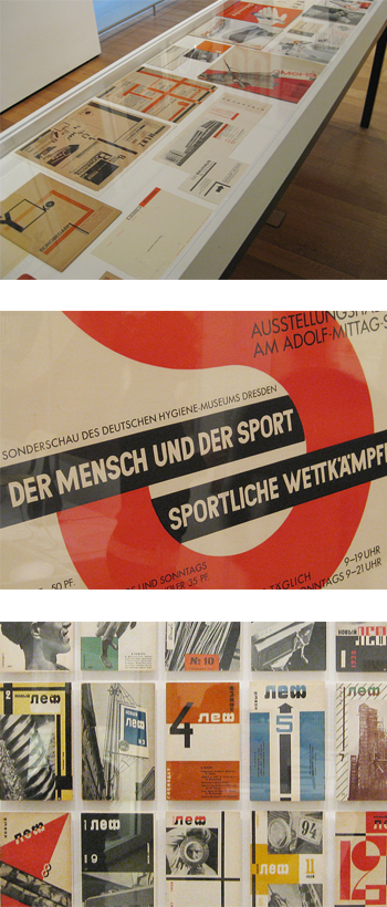
El Lisstzky, a key figure in the development of the New Typography movement, was one of the first designers to abandon the classical rules of typography and advocate asymmetrical layouts, geometric shapes, a limited range of colors, and sans serif letter-forms. He’s considered the first person to apply modern art techniques to typography. Lisstzky’s principles were later adopted by Maholy-Nagy and applied to the famous Bauhaus course.
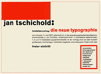
When he visited the Bauhaus exhibition in 1923, Jan was impressed with much of the work, especially Lissitzky’s, and was heavily influenced by the modernistic principles that he had witnessed. This influence was seen as he began to construct the principles and guidelines for a new era of typography. In 1928, Jan Tschichold published his book, ‘Die Neue Typographie’ (German for “The New Typography”). He aimed to make guidelines for a new era of typography in a time when it relied too heavily on beauty rather than clarity and functionality. These guidelines helped with attaining clear, functional, and simplistic type that would greatly enhance the readability of printed literature. It become a textbook for functional typography and its methods were quickly adopted be many printers and designers. This is when the New Typography movement really began to take off.
The Guidelines
Tsichichold believed in limiting typefaces and, much like Lissitzky, strongly favored bold, sans serif types, which don’t feature “serifs” at the end of the letters’ strokes. He believed these to be more expressive than other typefaces, more simplistic, and clearer. He also favored asymmetrical arrangement of type and was a proponent of standardized paper sizes.
In Conclusion
The New Typography movement provided a much needed re-haul of typographic techniques in an age when new technology was more easily allowing typographers to experiment with the ways they could arrange type on a page. “Die Neue Typographie” provided guidelines that quickly caught on and helped birth a new era of typography.